7 Basic QC Tools
The Seven Basic Tools of Quality is a designation given to a fixed set of graphical techniques identified as being most helpful in troubleshooting issues related to quality They are called basic because they are suitable for people with little formal training in statistics and because they can be used to solve the vast majority of quality-related issues
Seven QC tools are fundamental instruments to improve the quality of the product. They are used to analyze the production process, identify the major problems, control fluctuations of product quality, and provide solutions to avoid future defects. Statistical literacy is necessary to effectively use the seven QC tools. These tools use statistical techniques and knowledge to accumulate data and analyze them.
Seven QC tools are utilized to organize the collected data in a way that is easy to understand and analyze. Moreover, from using the seven QC tools, any specific problems in a process are identified.
The tools are
- The check sheet - is used to easily collect data. Decision-making and actions are taken from the data.
- The cause-and-effect (a.k.a., "fishbone" or Ishikawa diagram) - (Fishbone Diagram) is used to figure out any possible causes of a problem. After the major causes are known, we can solve the problem accurately.
- The control chart - provides control limits which are generally three standard deviations above and below average, whether or not our process is in control.
- The histogram - shows a bar chart of accumulated data and provides the easiest way to evaluate the distribution of data.
- The Pareto chart - is used to define problems, to set their priority, to illustrate the problems detected, and determine their frequency in the process
- The scatter diagram - is a graphical tool that plots many data points and shows a pattern of correlation between two variables.
- Stratification (alternately flow chart or run chart) - shows the process step by step and can sometimes identify an unnecessary procedure.
Statistical methods are effective tools for improving the production process and reducing its defects. However, you must keep in mind that statistical tools are just tools; they would not work, if used inadequately, where it is mandatory to have a formal training. 7 QC Tools provide right approach for any kind of improvement activity or problem solving. These tools lend objectivity & accuracy to observation and decision making. For each of the 7 BASIC QC TOOLS the followings topics are covered during the training program.
- Description of the tool
- When to use the tool (application)
- Procedure to apply the tool
- Interpretation tips for the tool
- Examples/Case study of application
- Exercises to support learning
EXPLANNATION ON FEW TOOLS
1. Check Sheet
- Also called: defect concentration diagram
Description - A check sheet is a structured, prepared form for collecting and analyzing data. This is a generic tool that can be adapted for a wide variety of purposes.
When to Use a Check Sheet
- When data can be observed and collected repeatedly by the same person or at the same location.
- When collecting data on the frequency or patterns of events, problems, defects, defect location, defect causes, etc.
- When collecting data from a production process.
Check Sheet Procedure
- Decide what event or problem will be observed. Develop operational definitions.
- Decide when data will be collected and for how long.
- Design the form. Set it up so that data can be recorded simply by making check marks or Xs or similar symbols and so that data do not have to be recopied for analysis. Label all spaces on the form.
- Test the check sheet for a short trial period to be sure it collects the appropriate data and is easy to use.
- Each time the targeted event or problem occurs, record data on the check sheet.
Check Sheet Example 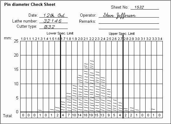
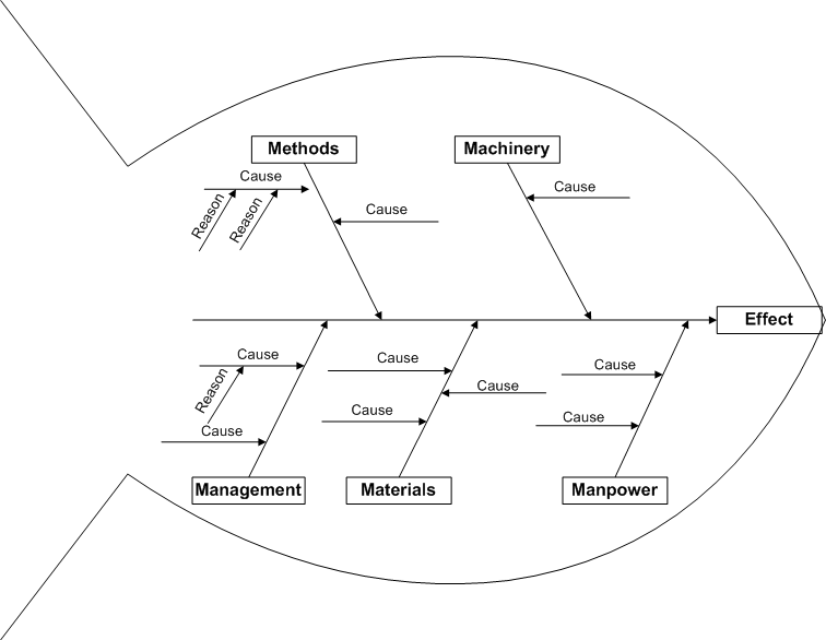
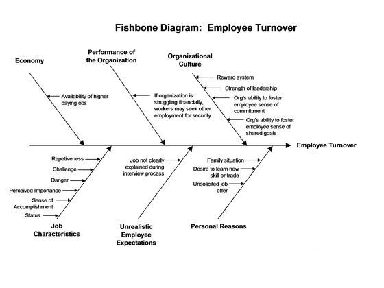
2. Fishbone Diagram - Also Called: Cause-and-Effect Diagram, Ishikawa Diagram Variations: cause enumeration diagram, process fishbone, time-delay fishbone, CEDAC (cause-and-effect diagram with the addition of cards), desired-result fishbone, reverse fishbone diagram
Description -
The fishbone diagram identifies many possible causes for an effect or problem. It can be used to structure a brainstorming session. It immediately sorts ideas into useful categories.
When to Use a Fishbone Diagram
- When identifying possible causes for a problem. Especially when a team’s thinking tends to fall into ruts.
Fishbone Diagram Procedure -
Materials needed: flipchart or whiteboard, marking pens
Agree on a problem statement (effect). Write it at the centre right of the flipchart or whiteboard. Draw a box around it and draw a horizontal arrow running to it. Brainstorm the major categories of causes of the problem. If this is difficult use generic headings:
- Methods
- Machines (equipment)
- People (manpower)
- Materials
- Measurement
- Management, Environment… etc,
Procedure
- Write the categories of causes as branches from the main arrow.
- Brainstorm all the possible causes of the problem. Ask: “Why does this happen?” As each idea is given, the facilitator writes it as a branch from the appropriate category. Causes can be written in several places if they relate to several categories.
- Again ask “why does this happen?” about each cause. Write sub causes branching off the causes. Continue to ask “Why?” and generate deeper levels of causes. Layers of branches indicate causal relationships.
- When the group runs out of ideas, focus attention to places on the chart where ideas are few.
Fishbone Diagram Example –
3. Control Chart
Description
The control chart is a graph used to study how a process changes over time. Data are plotted in time order. A control chart always has a central line for the average, an upper line for the upper control limit and a lower line for the lower control limit. These lines are determined from historical data. By comparing current data to these lines, you can draw conclusions about whether the process variation is consistent (in control) or is unpredictable (out of control, affected by special causes of variation).
Control charts for variable data are used in pairs. The top chart monitors the average, or the centering of the distribution of data from the process. The bottom chart monitors the range, or the width of the distribution. If your data were shots in target practice, the average is where the shots are clustering, and the range is how tightly they are clustered. Control charts for attribute data are used singly.
When to Use a Control Chart
- When controlling ongoing processes by finding and correcting problems as they occur.
- When predicting the expected range of outcomes from a process.
- When determining whether a process is stable (in statistical control).
- When analyzing patterns of process variation from special causes (non-routine events) or common causes (built into the process).
- When determining whether your quality improvement project should aim to prevent specific problems or to make fundamental changes to the process.
4. Histogram
Description -
A frequency distribution shows how often each different value in a set of data occurs. A histogram is the most commonly used graph to show frequency distributions. It looks very much like a bar chart, but there are important differences between them.
When to Use a Histogram
- When the data are numerical.
- When you want to see the shape of the data’s distribution, especially when determining whether the output of a process is distributed approximately normally.
- When analyzing whether a process can meet the customer’s requirements.
- When analyzing what the output from a supplier’s process looks like.
- When seeing whether a process change has occurred from one time period to another.
- When determining whether the outputs of two or more processes are different.
- When you wish to communicate the distribution of data quickly and easily to others.
5. Pareto Chart
Also called: Pareto diagram, Pareto analysis Variations: weighted Pareto chart, comparative Pareto charts
Description -
A Pareto chart is a bar graph. The lengths of the bars represent frequency or cost (time or money), and are arranged with longest bars on the left and the shortest to the right. In this way the chart visually depicts which situations are more significant.
When to Use a Pareto Chart
- When analyzing data about the frequency of problems or causes in a process.
- When there are many problems or causes and you want to focus on the most significant.
- When analyzing broad causes by looking at their specific components.
- When communicating with others about your data.
6. Scatter Diagram
Also called: scatter plot, X–Y graph
Description -
The scatter diagram graphs pairs of numerical data, with one variable on each axis, to look for a relationship between them. If the variables are correlated, the points will fall along a line or curve. The better the correlation, the tighter the points will hug the line.
When to Use a Scatter Diagram
- When you have paired numerical data.
- When your dependent variable may have multiple values for each value of your independent variable.
- When trying to determine whether the two variables are related, such as…
- When trying to identify potential root causes of problems.
- After brainstorming causes and effects using a fishbone diagram, to determine objectively whether aparticular cause and effect are related.
- When determining whether two effects that appear to be related both occur with the same cause.
- When testing for autocorrelation before constructing a control chart.
7. Stratification
Description
Stratification is a technique used in combination with other data analysis tools. When data from a variety of sources or categories have been lumped together, the meaning of the data can be impossible to see. This technique separates the data so that patterns can be seen.
When to Use Stratification
- Before collecting data.
- When data come from several sources or conditions, such as shifts, days of the week, suppliers or population groups.
- When data analysis may require separating different sources or conditions.
|
 ISO Consultants in Kolkata
  Quality Foundation